It has been a predictably manic couple of weeks at Beavertown towers. The brewery has held the successful southern launch party for this year’s Rainbow Project, a full-scale website redesign is in its final stages, and they’ve scooped a number of awards for their beer in the process.
Among all this, creative director Nick Dwyer took time out of Beavertown’s preparations for this year’s successful Indy Man Beer Con to discuss his journey within the business, designing for cans, and what elements he identifies are needed for great beer packaging.
TBJ – How did you into get into illustration and how did your relationship with Beavertown come about?
ND – I got into illustration to win over girls… (Why does anybody do anything?!?) I was the sort of young guy that would focus my attention on one particular lady, bombarding her with mix tapes and little drawings. It was kind of an edge over the captain of the football team sort of guy as a captain of the jaffa cakes sort of a guy.
Then a few days later I would claim to be in love, or maybe text them a few too many times a second, and would have to spend a week or so listening to Fall Out Boy in my room wondering why I couldn’t catch a break.
A few years of that sort of thing, then I studied graphic design in London, specializing in Illustration. One of my closest mates from university, James Rylance, got really into home brewing, and within months had landed the job of joining Logan in the kitchen of Duke’s Brew and Que in Haggerston, the primordial soup place of Beavertown Brewery.
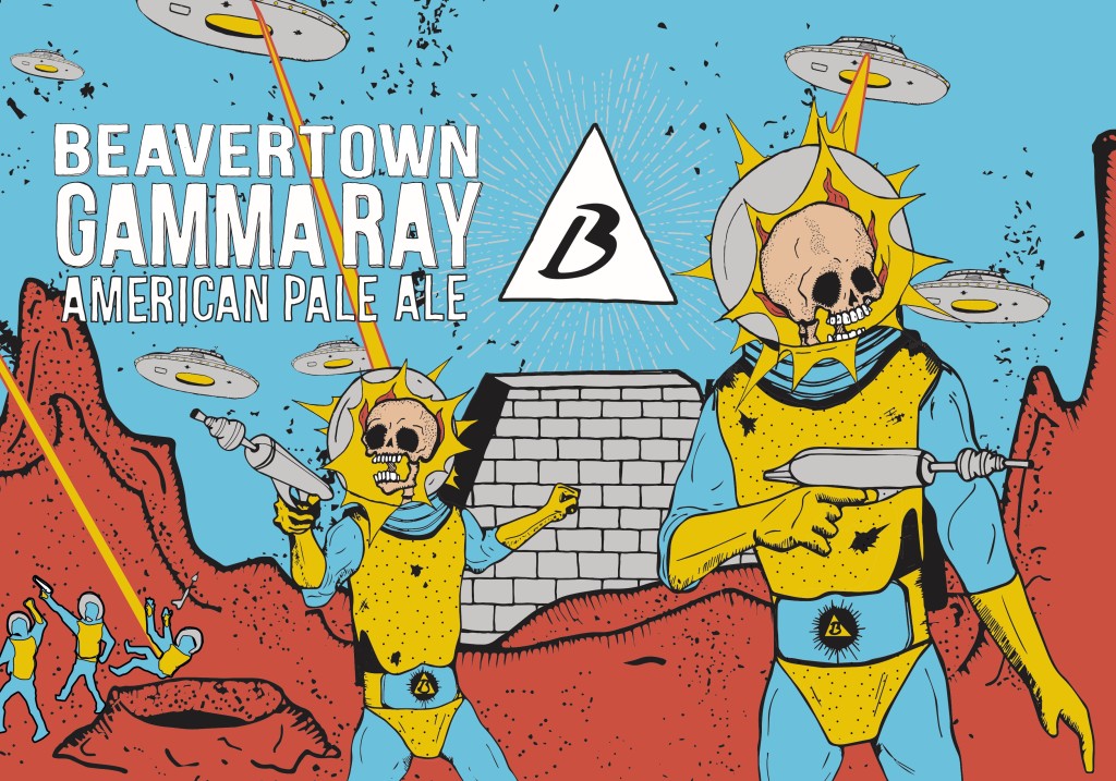
James sent me a message saying he would love me to have a crack at both ‘Black Betty’, and a then unnamed and totally foreign, unnamed Pale Ale – now ‘Gamma Ray’. I knew nothing of craft beer, but jumped at an opportunity so soon after graduating.
Logan and James would brew early in the morning to make room for the chefs coming in for dinner service, and I would join them mid morning to show what I had come up with.
A couple of times I came a bit later and saw how much fun it looked working in the restaurant. I was miserable trying to keep up silver service standards where I was waiting at the time so asked for a job.
A trial shift led to a job, which led to more time to sneakily coerce Logan into looking at my portfolio (“Oh sorry I was just on my way back from a meeting with a major agent for amazing illustrators, so sorry I left this open on your bed.”) I bagged a couple more designs, designed and put together the most basic of basic websites, worked almost two years in the restaurant, and eventually ended up in house as a designer. Soon after that we made the decision to go cans, at which point a rebrand was deemed appropriate. And here we are.