TBJ – You clearly draw inspiration from a number of different fields. What was the driving force behind your initial Beavertown designs?
ND – It felt like such a strange first brief, doing a beer label. I had been ingrained with aspirations to do editorials for trendy magazines but obviously, as an art graduate, would have knocked up a parish newsletter for my nan (and I did, she’s a saint) for any sort of press.
What really struck a chord was how much passion and thought was going into the beer that was being brewed, and I managed to channel that into what I’m passionate about in the way I saw the guys doing – Space and skeletons. I read a lot of graphic novels and comics and drew massively from the likes of Grant Morrison, Warren Ellis and Dave McKean’s writing and the subsequent illustrations.
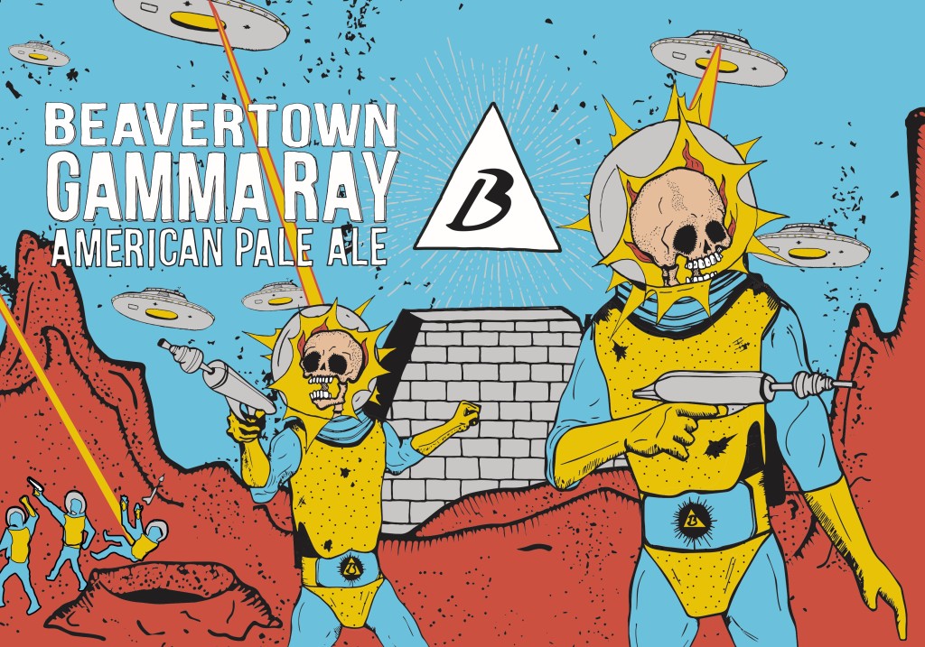
Logan talks a lot (too much) about ”breaking boundaries,” and this was no different. It was a case of going in with something I thought was amazing, and being told all the ways it could be better and more in line with everyone’s ideas and not just my own. It paved the way for all subsequent designs – ‘Gamma Ray’ specifically.
I would bring what I was into to the table and then Logan and anybody else working / hanging around at the time could have input, then I would draw it and it would look like I was really clever and had all the ideas in the world. Result. The skeleton heads on Gamma Ray actually cover up human heads and were a direct result of late night “Mars Attacks” sessions.
TBJ – When did the decision come about to move away from the original designs and to adopt your work?
ND – As mentioned, going into cans sparked a huge rebrand. Before I designed the core Beavertown range, it was the fantastic illustrator, Jonah Schultz, who works at the Kernel as a brewer. The inspiration and direction there was taken from illuminati symbols and various other emblems, ending up with the dollar bill-like labels.
The artwork for cans brings a huge number of obstacles to the table when using a massive amount of detail and really thin line work. We did a lot of mocking up cans with the current art and played around with it but Logan kept coming back to the idea of the original space men from the original ‘Gamma Ray’ design.
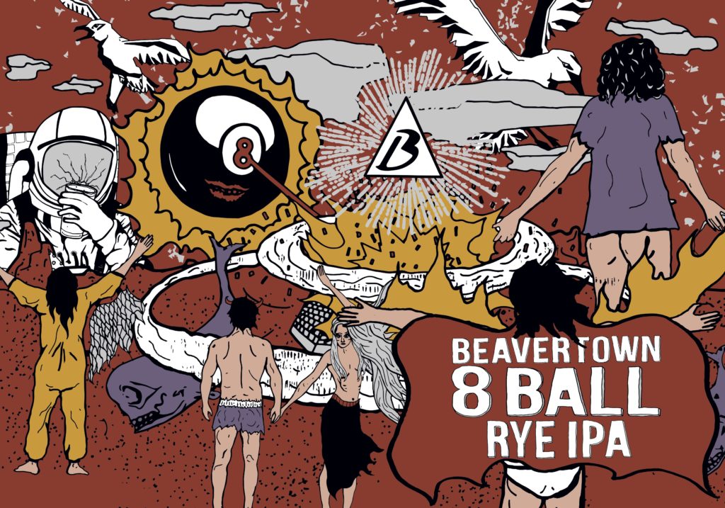
All of a sudden he just decided we needed to rebrand and that was that. I spent a couple of months strapped to a desk with my pens and at the end of it we had the five designs that would be our five core canned beers. It was really intense but so unbelievably satisfying.

