TBJ – Has the migration from bottles to cans for the brewery’s small pack sales influenced your approach at all?
ND – I suppose I kind of covered this, but coming from working in pen and watercolour / Promarkers, not being able to use textures effectively had a massive impact on the designs. It has definitely made the designs more character focused.
Labelling our cans really helps actually because we can get the matte texture we originally started using on the bottle labels (and has become incredibly prevalent amongst a lot of other craft breweries since!) and play with gloss in addition. Short answer, yes, but I’m kind of grateful for the opportunity to rethink things.
TBJ – What has been the greatest challenge in working at Beavertown and equally, what has been the area in which you’ve got the greatest satisfaction from?
ND – They are one in the same really. When the team was small I had a lot of jobs on top of the design like ordering boxes / dealing with the canning factory. As we have grown more appropriate people have taken on those roles but there are a few I have kept a tight grasp on.
TBJ – On a broader beer packaging note, what do you think makes an effective, standout design in 2015? What qualities do you identify as means to help the brand in question stand out?
ND – Its less about doing things for effect and more about reflecting what’s in the can/bottle/pint. People will instantly forget a product that lured them in with crazy packaging but failed to deliver.
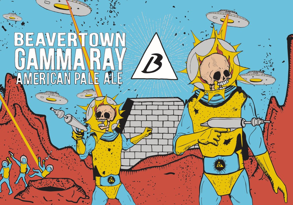
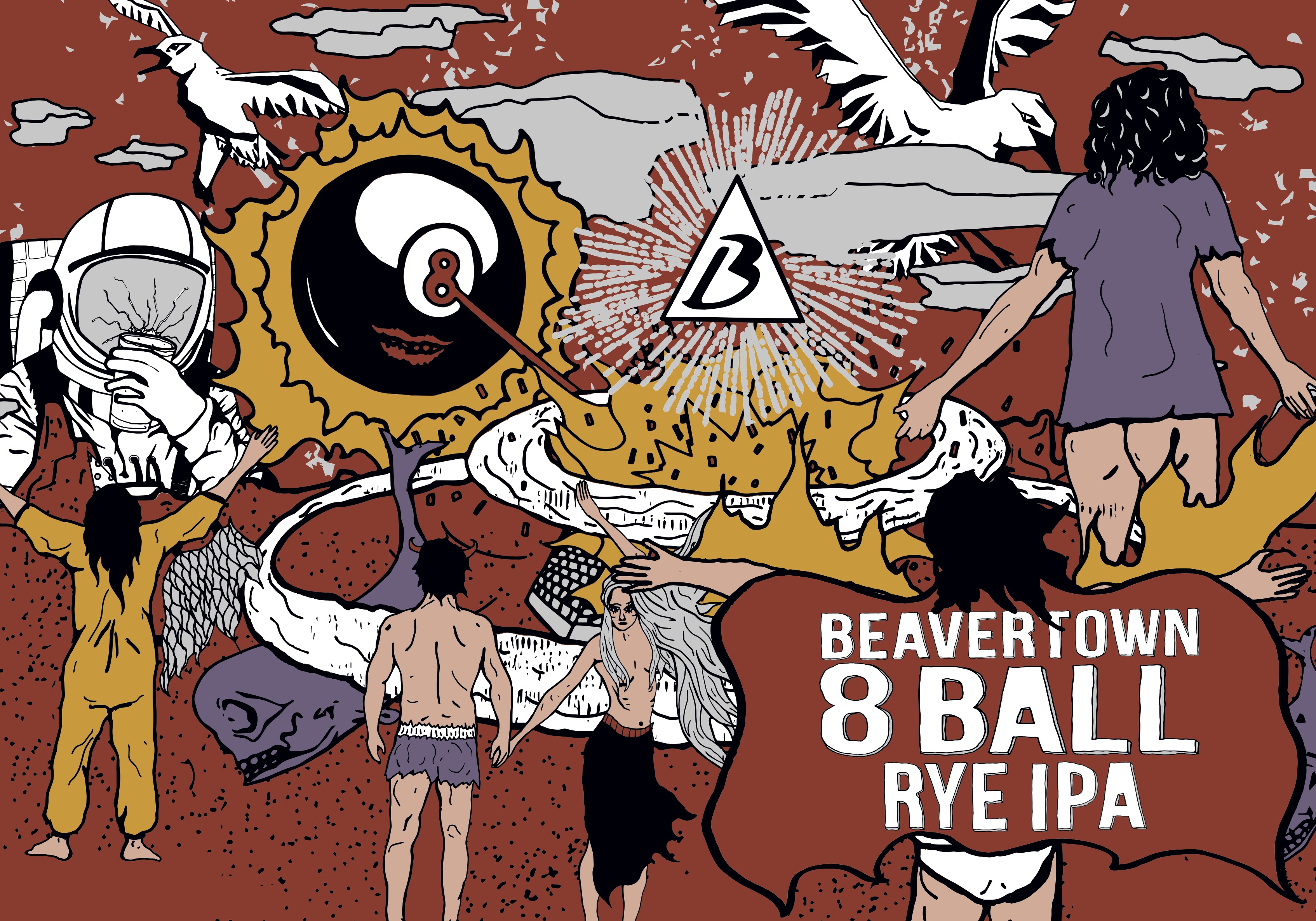
There are no absolutes though, and the most minimal design can shine brighter than a thousand space wizards on fire. Its about being true to the product and the person behind the products intentions.
Nothing needs crazy packaging, but it can be a great way to have a certain type of person gravitate towards it. We were recently crowned best UK brewery in a blind tasting (along with Supreme champion brewer) so I’m fully entitled to tell you how the beer will always be king! I just get to have the best job in the world because of it.
TBJ – For a brewery looking into its first label designs, or looking to rebrand them, what advice would you give them? Where do you start and what are the key elements should they focus on?
ND – Almost the same as above really. What are you looking to achieve overall? Its in any breweries interest to only put out beer they would drink so ensure it fits that criteria above all else then put it to some sort of panel, give yourself time to go back and change things and never rush through a design. My biggest mistake has consistently been thinking my first idea is my best and I can stop there.